Mixing prints and patterns in your outfits can be intimidating, but with a few guiding principals and some practice you can create some fun fashion moments.
For me, the goal of mixing prints and patterns is to create a unique and visually interesting combination. Visual interest can be created through thoughtful use of shape, scale, or color.
Obviously, texture is also a way to do this, and some people would classify a cable knit or those pompom balls as a pattern. I don’t disagree but for simplicity sake I’m going to ignore texture for now. I don’t think it’s really what comes to mind for most people when talking about missed print outfits.
Creating contrast through shape
Shapes are typically rounded (dots, florals, paisley) or angular (lines, plaids, geometrics). I would argue that some geometrics, depending on the pattern size, can give the eye a rounded impression. That’s why I said “typically”. Don’t get too hung up on the technicalities and go with the general impression of the shape.

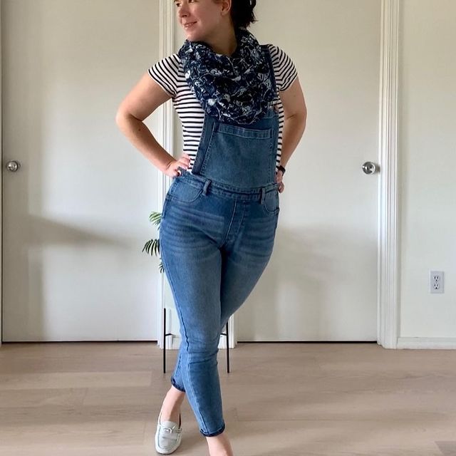
A floral skirt paired with a striped shirt creates contrast and visual interest because it disrupts the eye. Be careful not to overdo it because too much disruption can overwhelm the eye and prevent it from being able to focus and understand what it is seeing.
Finding the balance can be hard. Let your eyes be your teacher and spend some time looking at inspiration images on Pinterest, or study some of the designers who are generally acknowledge as masers of print. Dolce & Gabana are somewhat out of favor in the fashion world (for good reason) but they are absolute gods at mixing prints.
Need some outfit inspiration?
follow me on instagram to see my outfit of the day.
@rainydayrags
Create Contrast through scale
Another way to create visual interest is to combine shapes and patterns of different sizes. A small dot against aa large plaid gives the outfit a subtle detail and sophistication. A medium check against an oversized graphic print is fun and attention grabbing. Mixing a large plaid with a large dot might overwhelm the eye because the similarly sized patterns could be competing for the eye’s attention.
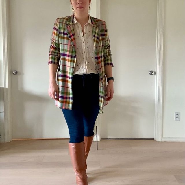
The key word here is “might”. Print mixing is an art and whether a combination works or not is very dependent on the specific pieces and a number of factors. Different sized prints clearly create distinct boundaries and visual contrast but prints of the same size can blend too much (pairing round with round or angular with angular), or compete too much and prevent the eye from focusing.
If you want to pair prints of similar scale, be sure to create contrast in other ways.
Create contrast through color
“Do these colors go together” is probably the question you ask yourself the most often when creating an outfit. It’s the most obvious, easiest, and safest way to introduce visual interest into an outfit. To effectively and confidently use color in any outfit, it helps to develop a familiarity with basic color palettes used in design.
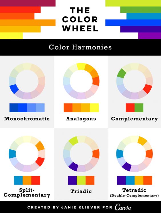
There are six main color palettes:
- Monochromatic uses tones and shades of one single color. Since black and white falls into this category, it’s a very easy place to start.
- Analogous uses three or four colors located next to each other on the color wheel. These tend to be low contrast but uniform look.
- Complementary palettes use colors that are opposite of each other on the color wheel. These tend to be high contrast schemes.
- The split-complementary color palette uses three colors. Color one and the two colors on either side of the color opposite of color one. (ex: If color one is blue, color two and three would be yellow and red)
- Triadic palette is based on three separate colors that are equidistant on the color wheel.
- A tetradic color scheme uses four colors that should form a rectangle when connected.
Many items in your closet will already have a defined color palette. The key is ensuring the palette in your top works with the palette in your bottom. For example. If your floral top is shades of green and yellow tones (analogous) you might want to pair it with a bottom that contains a similar color palette to keep things in harmony, maybe something that’s more in the green and blue camp to expand the color range. Alternatively, if you want to create a very bold look you could go for a bottom that has a complimentary palette containing one of the colors in your top (combines reds and greens or yellows and purples).
By consciously thinking about the color palette, you are working with you can create a cohesive look without appearing overly busy. Of course, you can always pair colors with neutrals. I don’t think that classifies as a color palette but you know…it’s a thing.
I would just say that no matter what palette you go for, be sure that you have one or two main colors. This is especially true if you go for palettes that bring in many different colors.
Getting started
If you are new to print mixing, I would suggest finding a few inspiration images and try to recreate them from the items in your closet. Since we all have different closets you may have to spend a little time analyzing your inspiration pictures to understand why they work and appeal to you. Or you may need to go shopping, yes please!
I’ve also created a video that reviews these ideas and provides examples of outfit I wear regularly. Check it out and let me know if any of them inspire you to try something new.
Ultimately, have fun. Fashion is about self-expression and if you like what you have on it’s a great look!
I hope this was useful information. Let me know what you think. What are your personal print mixing favorites?
Thanks for Reading!
